OUR DESIGNERS’ FAVOURITE FLOOR COVERINGS OF 2022
As the demand for Creative Matters’ carpets continues to increase so must our design team grow bigger. This year we have 13 designers not including our three Partners (Ali, Ana and Carol) who still love to fit in some design among their other responsibilities. We asked each designer to select their favourite 2022 carpet and they came up with 12 different answers, testament to the diversity of our creations.
LEAH PHILLIPS AND HATHAIRAT SUK-IEM CHOICE: LIVING ROOM RUG IN TORONTO
Handknotted in India, 50% mohair, 50% wool, designed by Sophie Williams. Photo: Simon Tanenbaum
Leah: I love this dramatic, painterly abstract floral design. The designer had previously painted custom murals throughout the home and the rug shares the same energy and bright pops of colour. The mohair and wool finish is richly textured and the colours of the fibres are beautifully saturated with a feel of pooling ink along the edges of the of the motifs. I chose this rug because it’s a beautifully textural, colourful and artistic rug that is a wonderful example of a custom piece doing exactly what it should. All elements are perfectly placed in relation to the furniture and surroundings and the rug pulls everything together.
Hathairat: This rug is a custom residential living room rug that encapsulates Sophie's original artwork through watercolour motifs. I selected this rug because it has transformed the living room into a delightful flower garden! The colours harmoniously complement each other and the beautiful hand-painted forest wall in the dining space to brighten the room and create a sense of being one with nature.
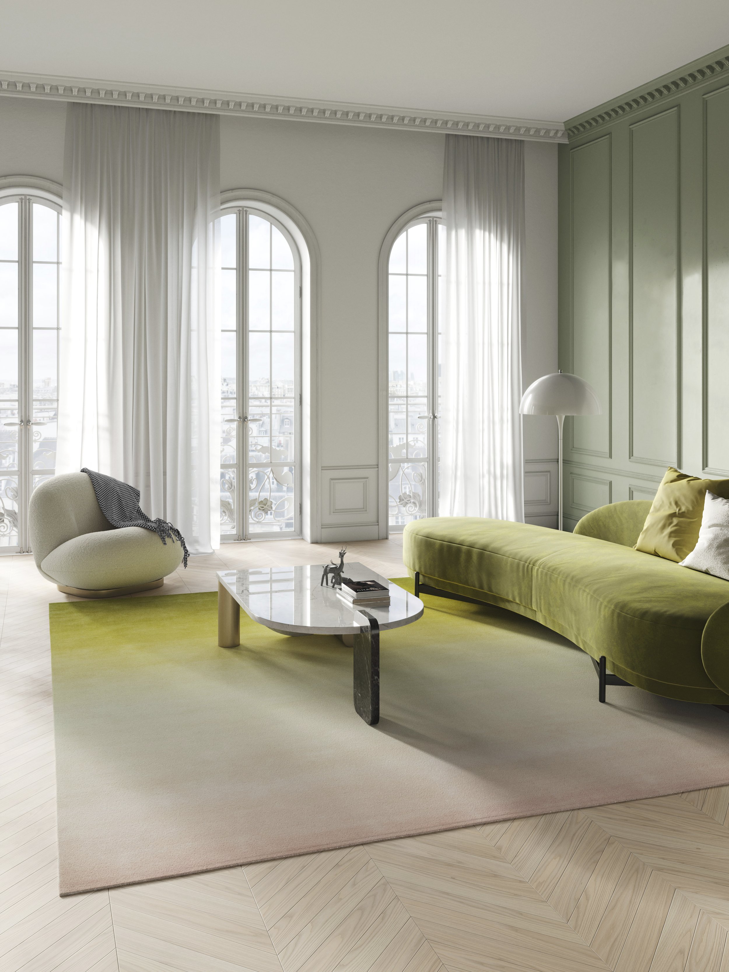
ANNA PANOSYAN CHOICE: CHORD GRADIENT RUG FROM THE SONANCE COLLECTION
Handknotted in Nepal, 100% fine Tibetan wool, designed by Clémence Hardelay.
This is a simple yet very sophisticated gradation from dusty rose to chartreuse. I love the calmness and elegance, it takes me on a walk through a garden in a summer misty morning when you cannot clearly see anything and only perceive the hues and shades of your surroundings.
SANDRA CIGANIC-MCKINNEY CHOICE: AURA RUG FOR THE PARIS DESIGN WEEK INSTALLATION
Handtufted in Thailand, 100% Chinese silk, designed by Mengting Shen. Photo: Anna Muller
Inspired by the aurora borealis, this design is a sequence of light beams broken into minimalist forms. I love the dynamic nature of the piece - the feeling that this is a portal to somewhere mysterious, drawing me into a tunnel. The colours are luminous and almost vibrating, an experiential design.
CLÉMENCE HARDELAY CHOICE: RUG FOR AN ART GALLERY IN PARIS
Handtufted in Thailand, New Zealand wool and silk, designed by Kat Pezzano.
This carpet is one of two that Creative Matters designed for a temporary art gallery. The idea was to represent a detail from the art hanging on the walls by artist Mathieu Dagorn. He was inspired by forged iron, referencing the balcony railing. The design comprises very simple geometric lines that create a rhythm/gradient from thicker to thinner as well as from dark anthracite to light grey on a very light, clean and fresh grey. I love the brushstroke effect, the volume created with silk blends, and the right amount of light and dark anthracite colours, highlighted by two different pile heights. The pattern looks as if it is emerging from the field.
KAYLA BORTOLOTTO CHOICE: RUBATO RUG FROM THE SONANCE COLLECTION
Handknotted in Nepal, Tibetan wool with 40% Chinese silk, designed by Sophie Williams.
Rubato has a harmonious balance of rectilinear shapes with smooth curves. A contemporary geometric that has a calming elegance with its shifting tones of mauve, blush, aubergine, porcelain and smokey grey. I’m drawn to the sophisticated colour palette, the way the colours shifts so effortlessly and how the varying shapes in the design create a rhythmic harmony.
MADELEINE BAIGENT CHOICE: CARPET FOR THE VERSANTE HOTEL IN VANCOUVER
Woven Axminster made in China, 80% wool, 20% nylon, designed by Madeleine Baigent. Photo: Larry Goldstein
This carpet sits in a light and airy event space. Pretty motifs of butterflies, flowers and bubble-like shapes cascade across a purpley-grey background. I first worked on this project back in 2018 and it was memorable for me due to its playful nature. Because woven Axminster uses low resolution artwork, we don’t often see such figural elements in this method of production. It was a fun challenge to create the artwork without sacrificing the nature of the motifs or making them too pixelated.
KAT PEZZANO CHOICE: PRESIDENTIAL SUITE RUG AT THE PEARLE HOTEL & SPA NEAR TORONTO
Hand Axminster, woven and hand finished in China, 80% wool, 20% nylon, designed by Kayla Bortolotto. Photo: Simon Tanenbaum
This is a beautiful textural design using neutral colours with gold and cream highlights. I chose this rug because the design really suits the space. It creates an overall calm atmosphere that accents the organic lines of furniture in the room.
SOPHIE WILLIAMS CHOICE: SHIFTING OMBRE RUG FOR A PARIS TRADE SHOW
Handtufted in Thailand, 100% Chinese silk, designed by Clémence Hardelay. Photo: Anna Muller
This rug is a shifting gradient featuring warm vibrant colours. I am drawn to the rich colours blending effortlessly in a soft transition, contradicted by an inverting hard edge. The composition is subtle and elegant but leaves a lasting impression for the eye. I am reminded of the sensation when brushing velvet and changing the appearance of the lush surface.
ANA DIOSDADO CHOICE: AMBIENT GRADIENT FROM THE SONANCE COLLECTION
Handknotted in Nepal, 100% Tibetan wool, designed by Mengting Shen.
I chose this soft gradient as my favourite design of 2022 because it’s a beautifully dyed rug and with its soft - but vibrant - colours, it is such a marvelous piece to see in a space.
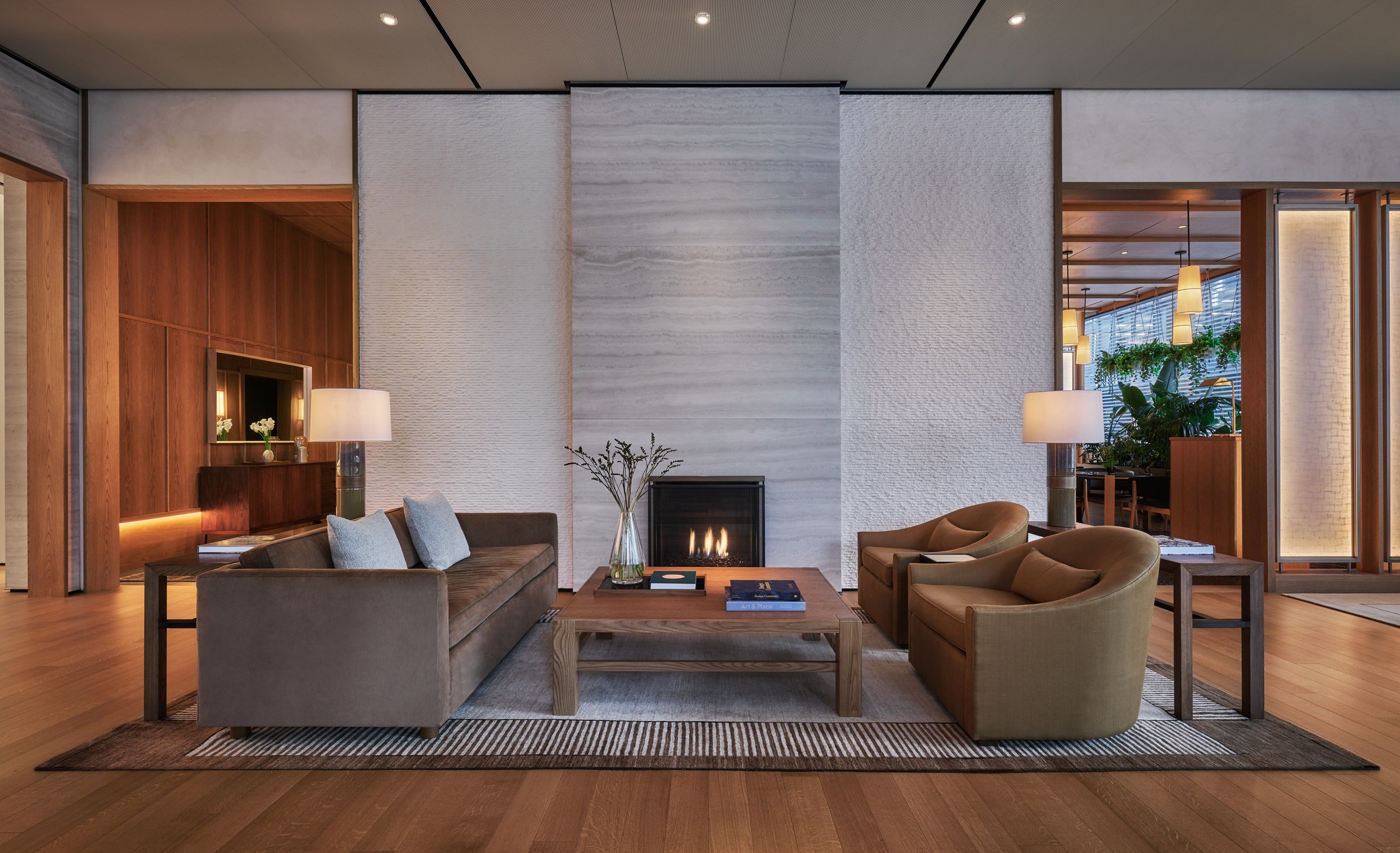
MENGTING SHEN CHOICE: LOBBY RUG FOR PENDRY MANHATTAN WEST
Handknotted in Afghanistan, 100% Ghazni wool, designed by Madeleine Baigent. Photo courtesy of Pendry Manhattan West.
Simple, elegant and timeless. Abrash dyeing gives the design more depth and makes it more interesting. I like the simplicity of this rug. It's quiet and calming. It feels like walking through a Japanese home.
ROSA WHARTON CHOICE: RETREAT RUG FROM THE MACRAME COLLECTION
Handwoven in a variety of techniques in India, 100% New Zealand wool, designed by Carol Sebert. Photo: Andrea Gibson
Retreat is a minimalist design that uses hand woven textures and lines to create depth and interest instead of the traditional use of colours and contrast. The different weaving techniques create areas of high and low relief while the wavy, undulating lines add rhythm and movement to the overall design. As a person from the Caribbean I often relate to textures, imagery and ambiences that remind me of home. In Retreat I not only see the ocean but I feel the sand between my toes, hear the waves crashing on the rocks and relish in the awe and tranquility that being near the sea brings me. Moreover, as a handweaver and knitter I love how these traditionally independent textures have been combined in a harmonious manner.
LAUREN MEAD CHOICE: BOSA DENNY GROUP LOUNGE AREA RUG
Handtufted in India, 100% wool, designed by Kat Pezzano.
This rug has an abstract, monochromatic blue design overlaid with an angular, geometric pattern created through cut and loop piles. I chose this design because I like the calming blue colour palette and the contrast that is created between the large, unstructured shapes and the angular geometric overlay. I also really like the repetition of the lines. I find the scale of the rug also adds to the impressiveness of the design.


